


Choosing a good house paint color must be done carefully to avoid common mistakes. Mistakes in selecting paint colors can make a home feel cramped, dark, and even uncomfortable. Unfortunately, many people only realize these mistakes after all the walls have been painted.
To avoid this, you need to know what common mistakes occur when choosing paint colors. Here are some mistakes in selecting house paint colors that should be avoided!
1. Not Testing Good Paint Colors
One common mistake in choosing house paint is only looking at colors from a catalog without testing them. In fact, paint colors in a catalog can look different when applied to the walls of your home.
This happens because each room has different sizes, wall textures, and lighting conditions. A color that looks bright in a catalog may actually appear darker when applied to your walls. Therefore, it is important to test the color first before buying paint in large quantities.
You can buy a sample of the desired paint first, then apply it to a small section of the wall. Observe how the color looks in the morning, afternoon, and evening to ensure it is truly a good house paint color.
2. Prioritizing Favorite Colors Too Much
Having a favorite color can sometimes be the basis for choosing a good house paint color. However, making it the only consideration can be a mistake. For example, you may like red, but it may not be suitable for use throughout the entire room.
Therefore, paint color selection should be based on the function of the room, the design concept, and the desired atmosphere. If you really want to use your favorite color but it is too bold, you can use it as an accent in certain areas.
3. Using Too Many Colors in One Room
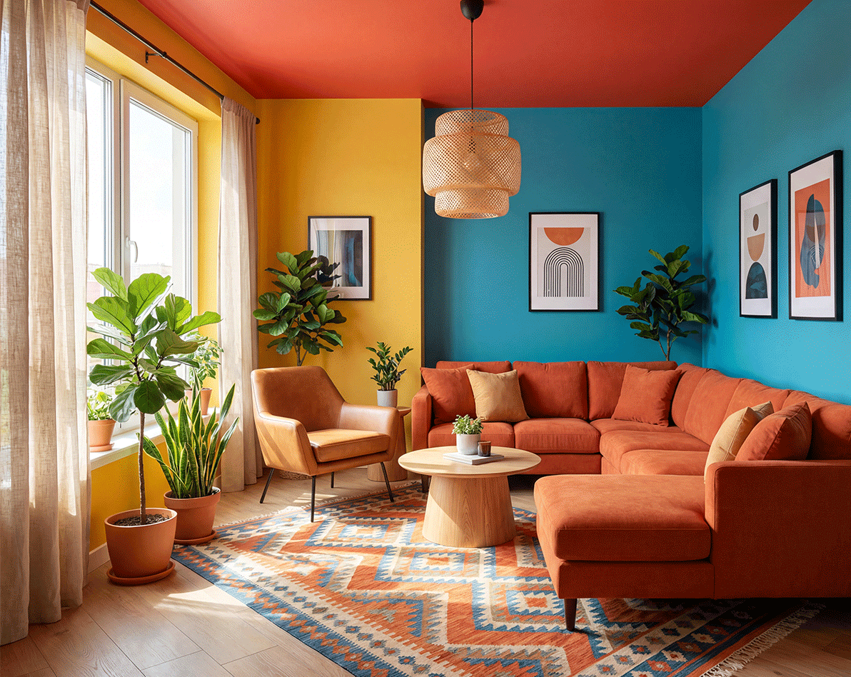
Another common mistake is combining too many colors in one room. This is sometimes done to make the room look unique and cheerful. However, too many colors can make the room look too busy and uncomfortable.
Ideally, you should use one main color with one or two supporting colors as accents. Using the right color composition and not too many colors will make the room look neat and comfortable.
4. Not Considering Lighting
Lighting has a big influence on how colors appear, making it an important aspect to consider. For example, a room with minimal light can make dark colors look dull, while in a well-lit room, dark colors can appear more vibrant.
Therefore, you should check paint samples while considering the room’s lighting. See how the color looks under sunlight or indoor lighting.
Read Also: How to Overcome the Effects of Hot Weather & UV Rays on House Walls
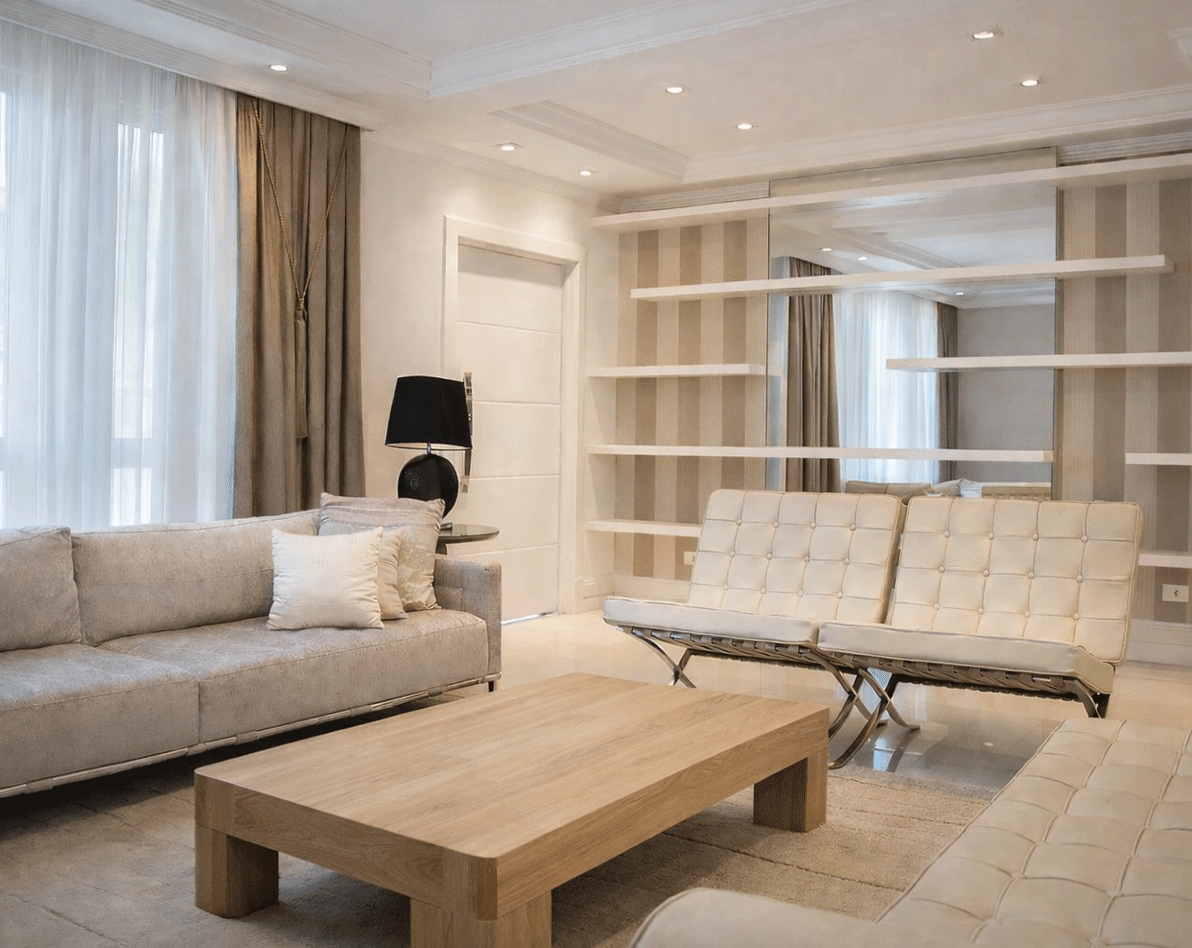
5. Ignoring Room Size
The size of a room can affect the impression created by the paint color. For small rooms, it is better to use neutral or light colors to create a more spacious feel. In larger rooms, darker colors can create a warmer atmosphere.
Excessive contrast can make a room feel cramped, so make sure to choose the right color combinations.
6. Ignoring Paint Finish
Another common mistake is focusing only on color without considering the paint finish. In fact, the finish affects both the appearance and durability of the paint. If the finish is not suitable for the room’s function, walls can get dirty easily and look less neat.
Here are the types of paint finishes you need to know:
- Matte/Doff: A smooth and elegant finish.
- Satin: Slightly glossy and easier to clean.
- Gloss: Very shiny and highly durable.
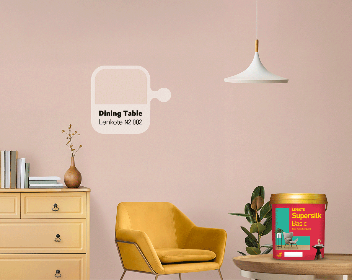
7. Ignoring Furniture Colors
When choosing a good house paint color, you need to consider other elements such as furniture and decorations. Without considering these, the paint color may not match and could clash. It is best to choose a paint color that complements the furniture and other interior elements in the room.
8. Following Trends Without Matching the House Concept
Color trends change over time, and many people follow them. However, trending colors are not always suitable for every home.
If you want to follow trends, make sure they match your home’s concept and architectural style. You can also choose neutral and timeless colors that can adapt to changing decoration trends.
Choose Good and High-Quality House Paint
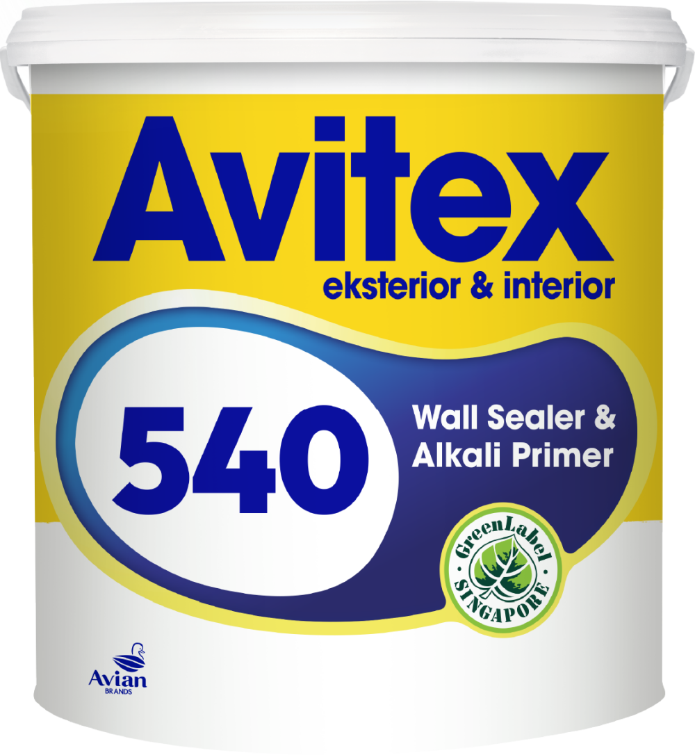
To achieve a good and even paint result, make sure to choose high-quality products. Supersilk Basic from Avian Brands is a premium interior paint that provides even coverage with super cover technology and an ultra-matte finish.
Supersilk Basic offers bright, long-lasting colors with excellent coverage. The color remains even even when used for touch-ups on certain areas.
The advantages of Supersilk Basic from Avian Brands:
- Anti-bacterial, mold, and mildew resistant.
- Best-in-class coverage.
- Covers wall imperfections.
- Suitable for interior walls and ceilings.
By using high-quality paint like Supersilk Basic, you can avoid common painting mistakes. Be sure to also pay attention to the points above to achieve the desired results. Create beautiful house paint colors with Avian Brands!


